

Explore components
-
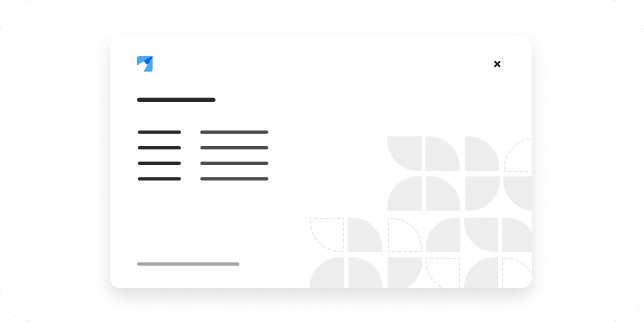
About modal
An about modal displays information about an application, like product version numbers and any appropriate legal text.
-
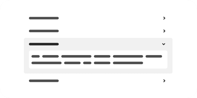
Accordion
An accordion is a vertically stacked list that can be expanded and collapsed to reveal and hide nested content.
-
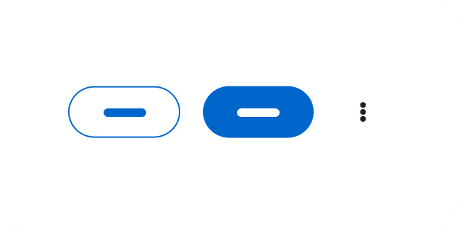
Action list
An action list is a group of actions, controls, or buttons with built-in spacing.
-
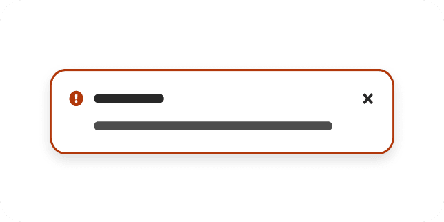
Alert
An alert is a non-intrusive notification that shares brief, important messages with users.
-
Application launcher
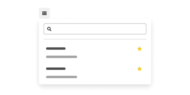
DemoAn application launcher is a menu that provides quick access to a set of related applications or tools.
-

Avatar
An avatar is a visual representation of a user, which can contain an image or placeholder graphic.
-
Back to top
The back to top component is a shortcut that allows users to quickly navigate to the top of a page via a button.
-

Backdrop
A backdrop is a screen that covers the main content of a page when a modal is opened, to prevent page interaction until the modal is dismissed.
-

Background image
A background image is an image that fills the background of a page.
-
Badge
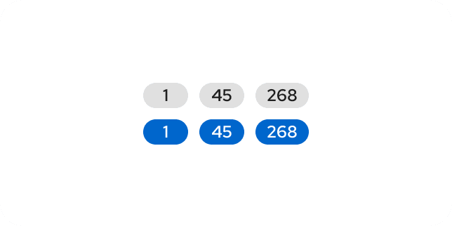
A badge is an annotation that displays a numeric value.
-
Banner
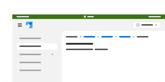
A banner is a short message that is shared with users in an unobtrusive, full-width container that cannot be dismissed.
-

Brand
A brand is a visual representation of a product—typically its logo.
-
Breadcrumb
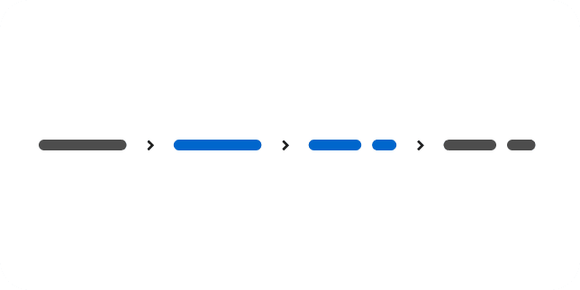
A breadcrumb is a secondary navigation method that shows where users are in an application, to help them navigate more efficiently.
-

Button
A button is an object that communicates and triggers an action when it is clicked or selected.
-
Calendar month
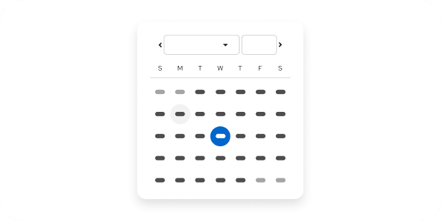
A calendar month displays a single month and allows users to select a date.
-
Card
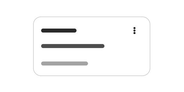
A card is a content container that displays entry-level information—typically within dashboards, galleries, and catalogs.
-
No preview yet
Catalog item header
ExtensionA catalog item header displays the title, icon, and metadata at the top of a catalog item detail view.
-
No preview yet
Catalog tile
ExtensionA catalog tile is a selectable card that presents a single item within a catalog view.
-
No preview yet
Chart
CustomA chart visualizes data sets as bar, line, area, pie, and other graph types.
-
Checkbox
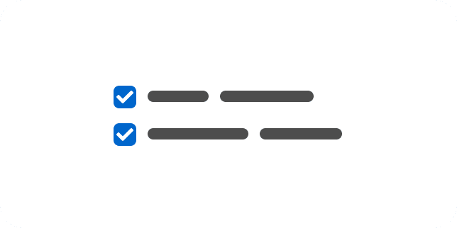
A checkbox is used to select one or more items from a list, or to turn an option on or off.
-
Chip
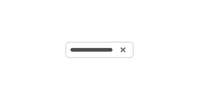
DeprecatedA chip is used to communicate a value or a set of attribute-value pairs within workflows that involve filtering a set of objects.
-

Click to load
HTMXClick to load appends the next set of results to a list when a user selects a load-more button.
-
Clipboard copy
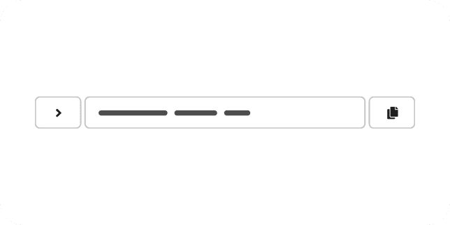
The clipboard copy component allows users to quickly and easily copy content to their clipboard.
-
Code block
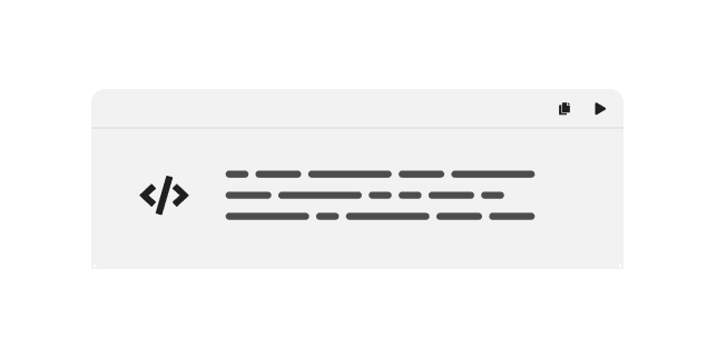
A code block contains 2 or more lines of read-only code, which can be copied to a user's clipboard.
-
Code editor
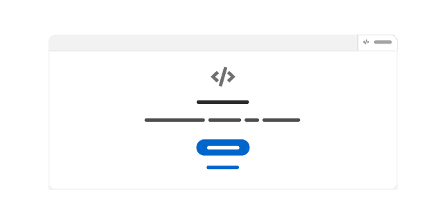
A code editor is a versatile Monaco-based text editor that supports various programming languages.
-
Content
A content component contains a block of styled HTML content.
-
Context selector
DemoA context selector allows users to switch between distinct contexts, such as projects or environments.
-
Custom menus
DemoCustom menus compose the menu building blocks into bespoke dropdown, select, and action patterns.
-
Data list
A data list displays large data sets and interactive content in a flexible layout.
-
No preview yet
Data view overview
ExtensionThe data view is a composable pattern for presenting data sets with a toolbar, table or card layout, and pagination.
-
No preview yet
Data view toolbar
ExtensionA data view toolbar provides search, filtering, and view controls for a data view.
-
No preview yet
Data view table
ExtensionA data view table renders a data set as a sortable, selectable table within a data view.
-
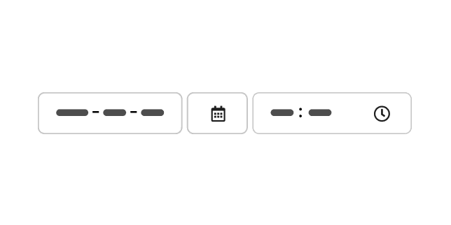
Date and time picker
DemoA date and time picker combines a date picker and a time picker to select a full date and time value.
-
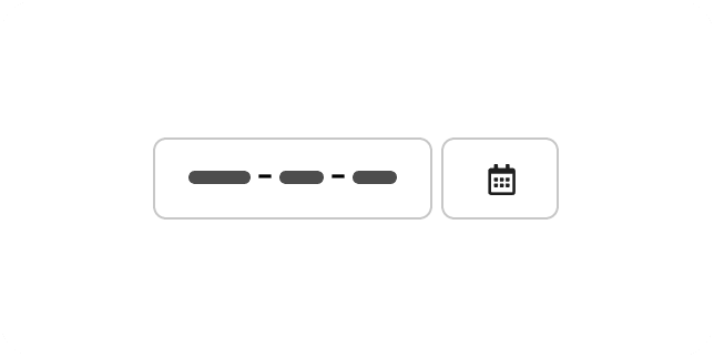
Date picker
A date picker is a text input with a calendar dropdown that allows users to select a date.
-
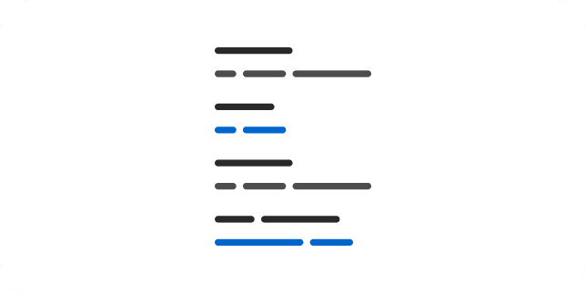
Description list
A description list displays terms and their corresponding descriptions.
-
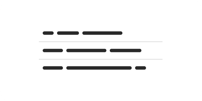
Divider
A divider is a horizontal or vertical line that is placed between screen elements to create visual divisions and content groupings.
-
No preview yet
Document editor
CustomA document editor embeds a Collabora Online editor for viewing and editing documents, spreadsheets, and presentations.
-
Drag and drop
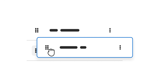
The drag and drop component allows users to reposition, rearrange, and group items into more relevant and appropriate layouts.
-
Drawer
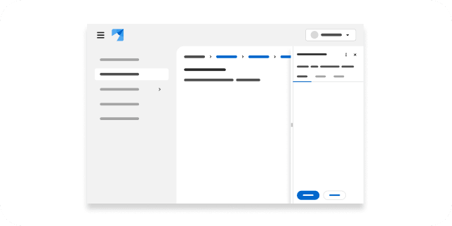
A drawer is a sliding panel that enters from outside of the viewport, which can be configured to either overlay content or create a sidebar by pushing content.
-
Dropdown
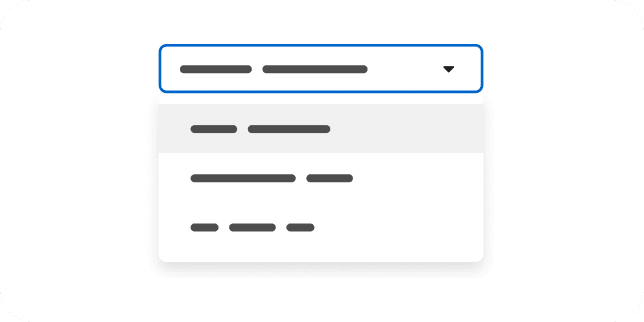
BetaA dropdown presents a menu of actions or links in a constrained space by toggling their visibility.
-
Dual list selector
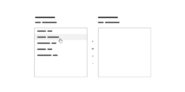
A dual list selector displays 2 interactive lists: a list of selected items and a list of available, selectable items. Users can move items between the lists.
-
Empty state
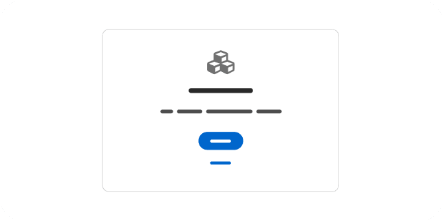
An empty state is a screen that is not yet populated with data or information—typically containing a short message and next steps for users.
-
Expandable section
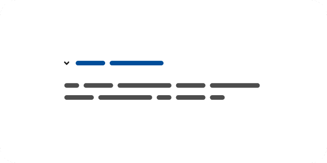
An expandable section is a content section with a text toggle that reveals content that is hidden by default.
-
No preview yet
Filter side panel
ExtensionA filter side panel presents grouped, selectable filters alongside a catalog or data view.
-
Form
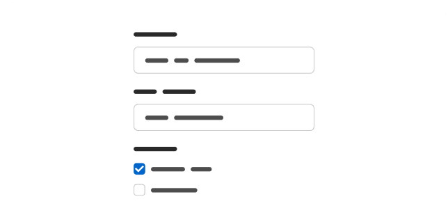
A form is a group of related fields, inputs, and controls that users complete and submit.
-
Form control
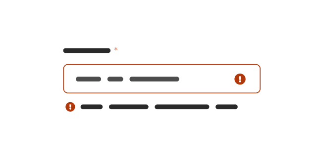
A form control provides the base styling for text inputs, selects, and other form fields.
-
Form select
A form select is a styled native select element for choosing a single option from a list.
-
Helper text
Helper text is a text-based support method that adds additional context to field inputs.
-
Hint
A hint is an in-app message that shares reminders, explanations, or calls to action within a page.
-
Icon
An icon component is a container that supports icons of varying dimensions and styles, as well as spinners.
-

Infinite scroll
HTMXInfinite scroll loads additional results automatically as the user scrolls toward the end of a list.
-
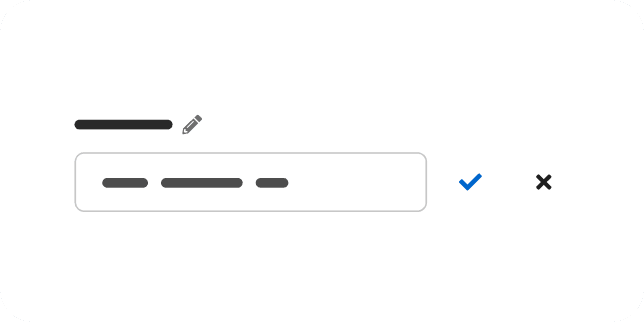
Inline edit
An inline edit component allows users to switch between read-only and edit views of description lists, page text elements, or tables—within the context of their current view.
-
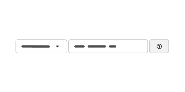
Input group
An input group combines multiple related controls or inputs to appear as a single control.
-
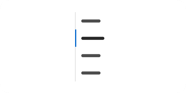
Jump links
When clicked, jump links allow users to navigate to sections within a page without scrolling.
-
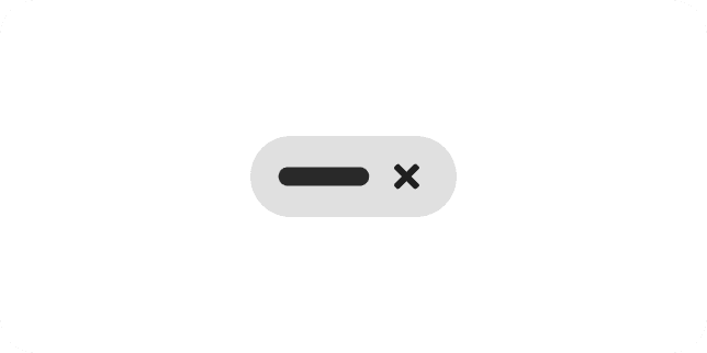
Label
A label is a descriptive annotation that adds context to an element for clarity and convenience.
-
Lazy modal
HTMXA lazy modal fetches its contents from the server the first time it is opened.
-

List
A list component embeds a formatted list—bulleted or numbered—into page content.
-
No preview yet
Form validation
HTMXForm validation gives users immediate, server-driven feedback about the values they enter into a form.
-
No preview yet
Sortable table
HTMXA sortable table reorders its rows when a user selects a column header, with sorting handled on the server.
-
No preview yet
Click to edit
HTMXClick to edit swaps a read-only value for an editable field in place when the user selects it.
-
No preview yet
Toast & confirm
HTMXToast confirm pairs a confirmation dialog with a toast notification to acknowledge a completed action.
-
No preview yet
Skeleton loading
HTMXSkeleton loading shows placeholder shapes while content is fetched, then swaps in the real content.
-

Live search
HTMXLive search updates a list of results as the user types, querying the server on each change.
-
No preview yet
Log viewer
ExtensionA log viewer displays streaming or static log output with search and line controls.
-
Login page
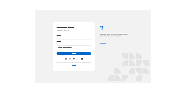
A login page allows a user to access an application by entering a username and password, or by authenticating using a social media login.
-
No preview yet
Map
CustomA map is an interactive, pannable map built on MapLibre for plotting markers and overlays.
-
Masthead
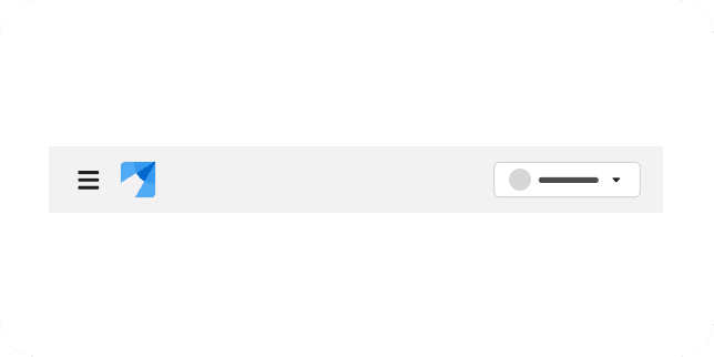
A masthead contains and organizes global properties like a logo, navigation, and settings for easy and consistent access across all pages of an application.
-
Menu
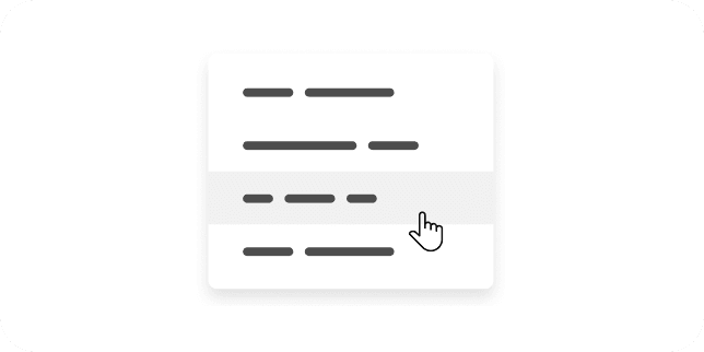
A menu is a list of options or actions that users can choose from.
-

Menu toggle
A menu toggle is the button that opens and closes a menu, dropdown, or select.
-
Modal
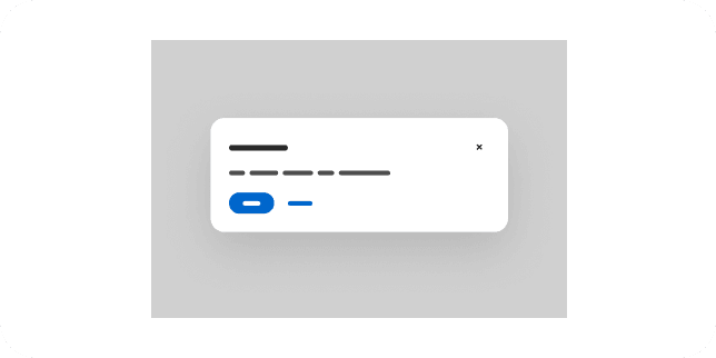
A modal is a window that overlays a page to display important information, without requiring users to navigate to a new page.
-
Multiple file upload
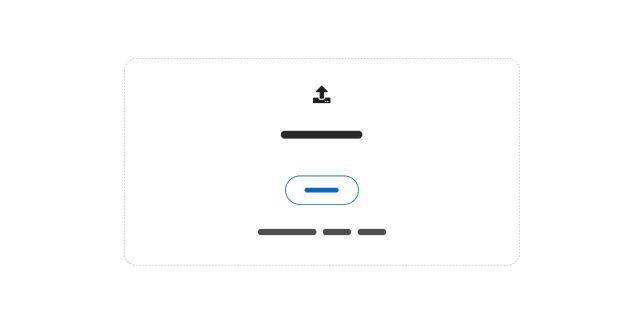
A multiple file upload allows users to add several files at once by dragging them onto a drop zone or browsing.
-
Navigation
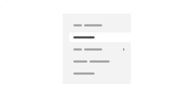
A navigation component organizes and communicates an application's structure and content in a central location, making it easy to find information and accomplish tasks.
-

Notification badge
A notification badge is a visual indicator that alerts users about incoming notifications.
-
Notification drawer
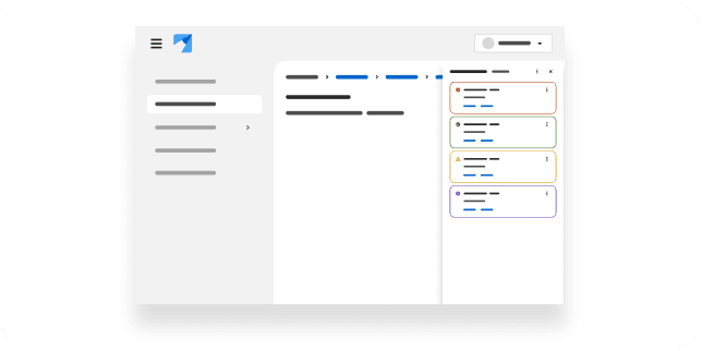
A notification drawer contains an application's notifications, which users can view and manage without having to navigate to a new screen.
-
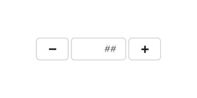
Number input
A number input combines a text input field with buttons to provide users with a quick and effective way to enter and modify a numeric value.
-
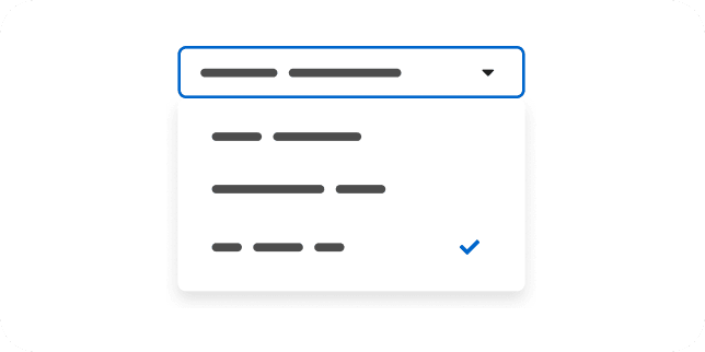
Options menu
DemoAn options menu presents a set of selectable options, such as sort or display settings, in a dropdown.
-
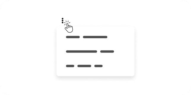
Overflow menu
An overflow menu groups a set of actions into a responsive horizontal list to help declutter the UI.
-
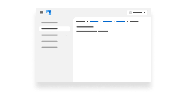
Page
A page component defines the basic layout of a page, with either vertical or horizontal navigation.
-
Pagination
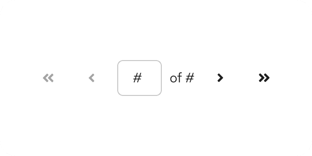
A pagination component allows users to navigate through large content views that have been split across multiple pages.
-
Panel
A panel is a customizable container that can contain other components in flexible content layouts.
-
Password generator
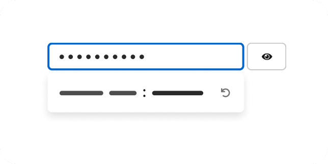
DemoThis demo demonstrates how to create an input field that generates unique passwords.
-
Password strength
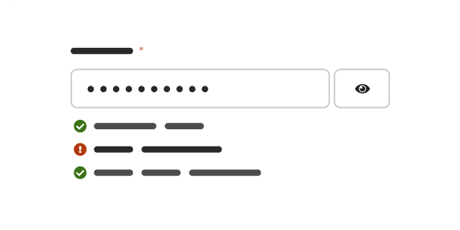
DemoThis demo demonstrates how to validate and display feedback about password strength.
-
Popover
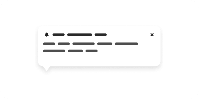
A popover is a small overlay window that provides additional information about an on-screen element.
-
Progress
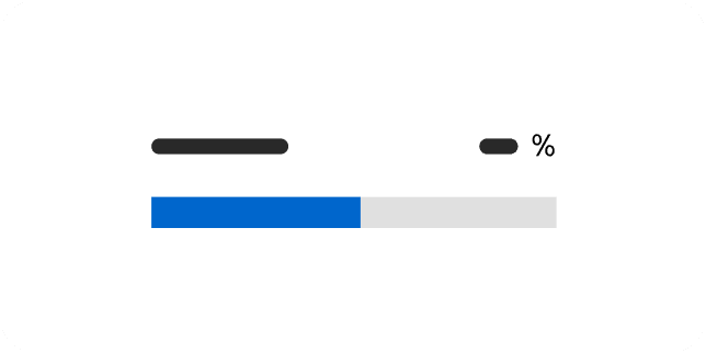
A progress component is a horizontal bar that indicates the completion status of an ongoing process or task.
-
Progress stepper
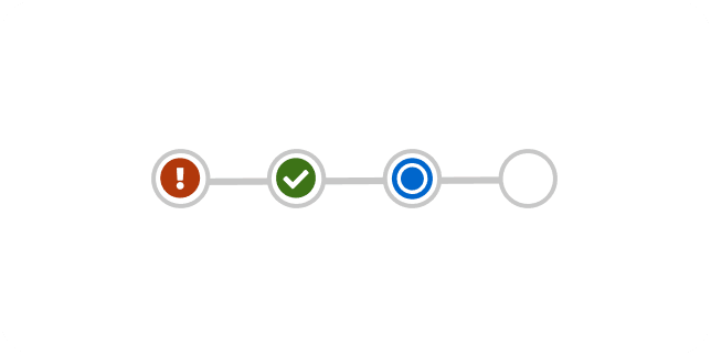
A progress stepper displays a timeline of tasks in a workflow and tracks a user's progress through the workflow.
-
No preview yet
Properties side panel
ExtensionA properties side panel lists an item's attributes as a set of property-value pairs beside the main content.
-
Radio
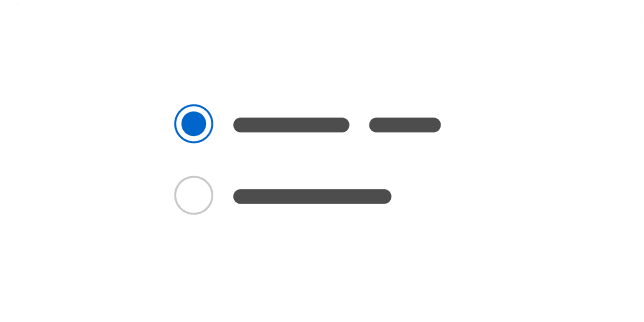
A radio button is used to select a single option from a set of mutually exclusive choices.
-
No preview yet
Rectangle selection
CustomRectangle selection lets users select multiple items by dragging a selection rectangle over them.
-
No preview yet
Rich text editor
CustomA rich text editor is a Quill-based editor for composing formatted text content.
-
No preview yet
Ripple
CustomRipple is a lightweight, pure-CSS loading indicator built from animated expanding rings.
-
No preview yet
Internationalization
CustomThe i18n demo shows how server-rendered components pick up translated messages from a message bundle.
-
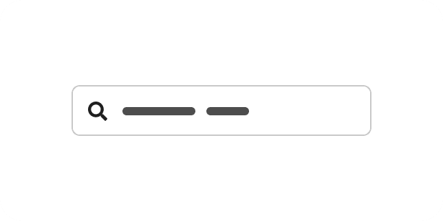
Search input
A search input is a type of input field that can be used to search, find, or filter.
-
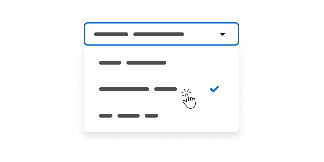
Select
BetaA select presents a menu of options within a form, allowing users to choose one or more values.
-
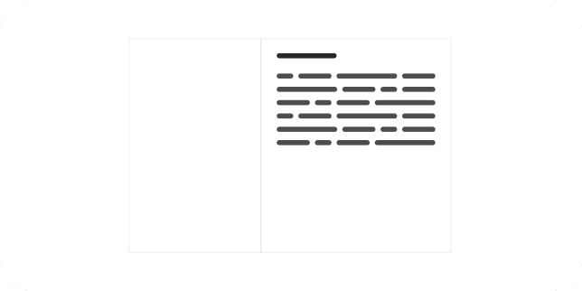
Sidebar
A sidebar is a panel that splits content into a secondary area within a page.
-
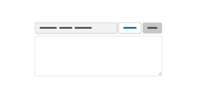
Simple file upload
A simple file upload provides a single-file input with a filename display and browse and clear controls.
-
Simple list
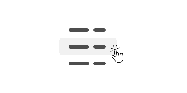
A simple list displays selectable items within a page.
-

Skeleton
A skeleton is a type of loading state that allows you to expose content incrementally.
-
Skip to content
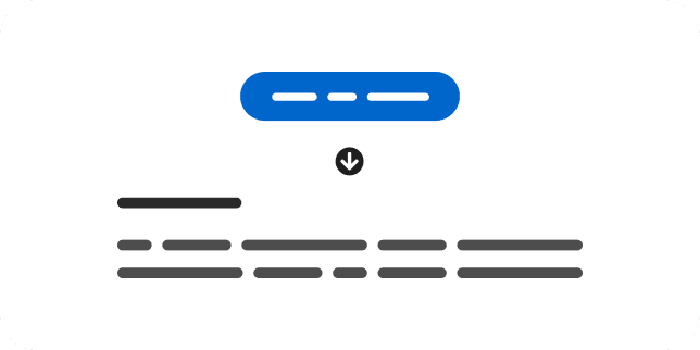
A skip to content component allows users to bypass navigation when using a screen reader or keyboard.
-
Slider
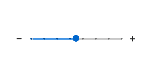
A slider is an interactive element that allows users to quickly set and adjust a numeric value from a defined range of values.
-

Spinner
A spinner is an animated visual that indicates when a quick action is in progress.
-
Switch
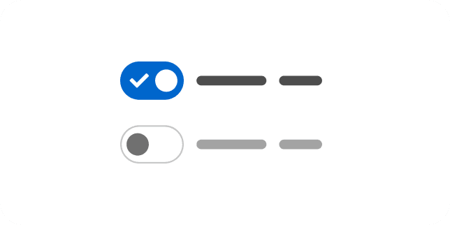
A switch is a control that toggles the state of a setting between on and off.
-
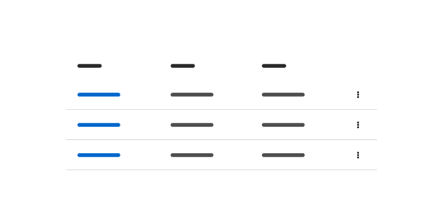
Table
A table displays large data sets in a simple grid with column headers.
-
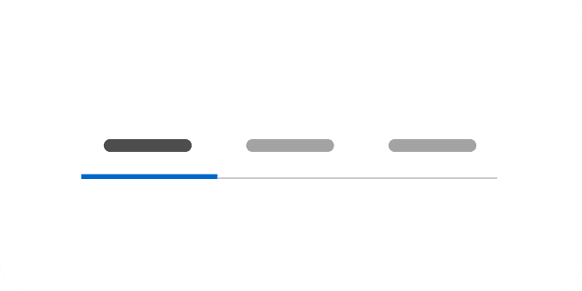
Tabs
Tabs group similar content within sub-views of a page.
-
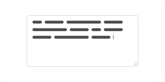
Text area
A text area is a multi-line text input for longer, free-form content.
-
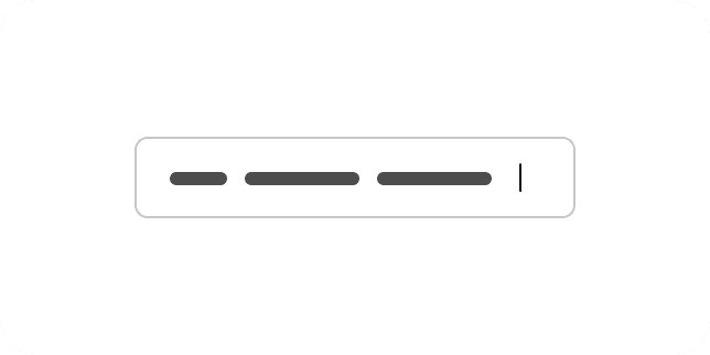
Text input
A text input is a single-line field for entering and editing short text values.
-
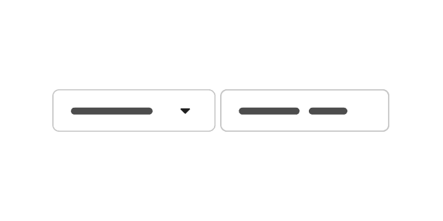
Text input group
A text input group is a more custom, flexible, and composable version of a text input that includes elements like icons and buttons.
-
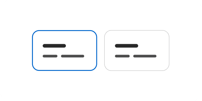
Tile
DeprecatedA tile is a container that allows users to select a static option.
-
No preview yet
Hero
A hero is a prominent, page-level banner used to introduce a landing or overview page.
-
No preview yet
Compass
Compass is a full-viewport layout for generative and conversational UIs, with a header, optional sidebars, main content, and a footer area that often uses a ChatBot message bar.
-
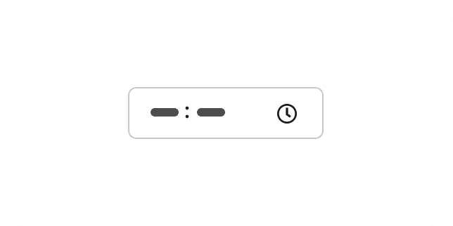
Time picker
A time picker is a text input with a dropdown that allows users to select a time of day.
-
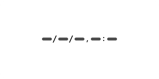
Timestamp
A timestamp is a consistently formatted visual that displays date and time values.
-
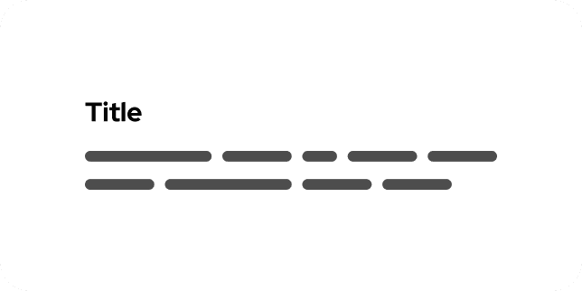
Title
A title component applies top and bottom margins, font-weight, font-size, and line-height to page and section headings.
-
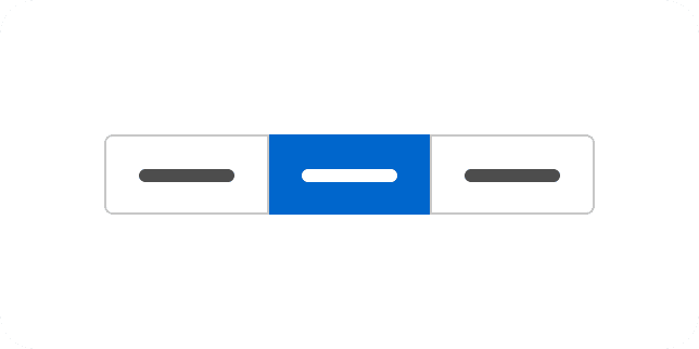
Toggle group
A toggle group is a set of controls that can be used to quickly switch between actions or states.
-
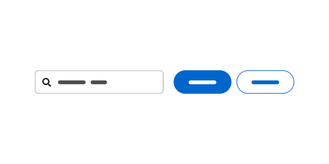
Toolbar
A toolbar is a responsive container that displays controls that allow users to manage and manipulate a data set.
-
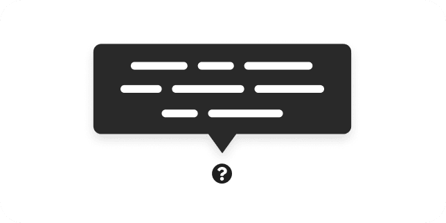
Tooltip
A tooltip is a small, temporary, overlay window that provides additional information about an on-screen element.
-
No preview yet
Topology
CustomA topology visualizes nodes and their relationships as an interactive graph.
-
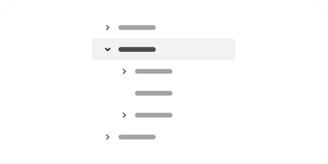
Tree view
A tree view is a structure that displays data in a hierarchical view.
-
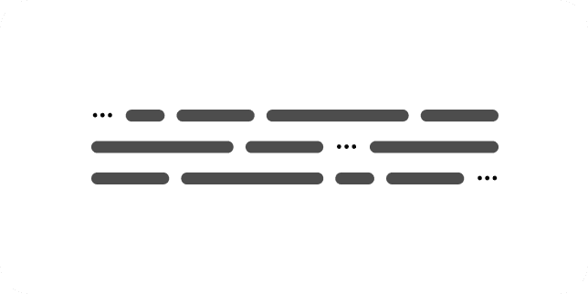
Truncate
A truncate component can be used to shorten character strings—typically when the string overflows its container.
-
No preview yet
User feedback
ExtensionA user feedback modal collects ratings and comments from users about their experience.
-
No preview yet
Vertical tabs
ExtensionVertical tabs group related content into panels selected from a vertical list of tabs.
-
No preview yet
Video player
CustomA video player embeds and controls video playback with a Video.js-based player.
-
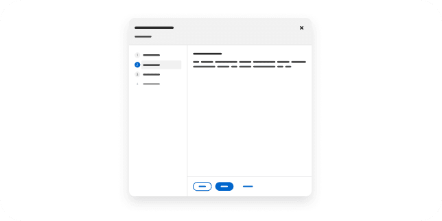
Wizard
A wizard is a guided workflow that helps users complete complex tasks, create objects, or follow a series of steps.